
overview
PROBLEM
The users worked within an outdated CHUI (Character-Based User Interface) from the 1980’s and manually updated data using a Microsoft Access database. Due to this, it was very hard for new employees to learn how to do basic tasks.
SOLUTION
Provide a modern GUI in place of the outdated systems. This GUI will allow tasks to be completed efficiently and new employees to learn much quicker. We did this by observing the current workflows and redesigning them to fit both modern GUI standards and their needs.
AUDIENCE
Corporate Sales Department (Sales Support)
ROLES
UX Designer, UX Researcher, UX Design Team
TIME FRAME
10 weeks (June 2020 – August 2020)
TOOLS
Figma, Pen, Paper
research process
discovery
Style Guide
To start off my internship project at Uline, my mentor, Eric, told me to review the style guide which Uline works within. It was important to be sure I was designing within their style guide so as to ensure this app would be consistent with their other internal apps. The strictness of the style guide was something that would take some time getting used to, with lots of help from my mentor. It also helped to show me how a well thought out design system speeds up the design process and allows for rapid prototyping to test different ideas (along with Figma's component functionality).
Research
We started our project with a team introduction, learning who the stakeholders, developers, and designers were. We got a glimpse into the current systems that the stakeholders work within. These systems were incredibly old, implemented in the late 1980’s. They were nicknamed “green screens”, due to only having green text on a black screen and navigated through the function keys. Similar to the image below.

An old-school interface. Only interactable with the keyboard.
After the introductions my mentor brought up the idea of digging deeper into the user tasks to better understand the interactions and how they worked each section. This was done through a three-hour meeting with one of the stakeholders, where the whole team watched her work through the green screens. Throughout this watch party we often interjected with our own questions and thoughts. These questions mainly regarded how we could transfer these manually typed tasks to take advantage of a GUI and help with learnability and efficiency.,
From this meeting we also found that lots of their work was done by manually inputting data into a database within Microsoft Access, which then (sometimes) fed into the Legacy database which the greenscreens were connected to. There was issues brought out about having to repeat data entry into the green screens due to data flow errors. So, we wanted to immediately remedy this issue of having to input data into two different sources, by simply combining them in the interface and correctly back feeding the data to the correct sources.
Findings
From the stakeholder interviews and the watch party we were able to split the functions into 4 main tasks. Along with that we found issues with the current implementation that we wanted to remedy.
Sales Territories
- Editing and Creating Sales
- Reassigning sales reps, managers, etc.
- Editing sales territory location, branch, etc.
File Upload
- Changes might come in bursts
- Users want to make file to do mass update
- Want to be able to do it for postal codes and territories
Postal Codes
- Territory borders change
- Need to reassign zip codes for changes
Hardcodes
- Customers might be spread out across multiple territories
- Users need to hard code certain customers to certain territories
Issues
- Outdated interaction for data entry
- Disconnection of where users input data
- Lots of manual data change repeated across differnet databases
- Learnability and efficiencies causes new employees training to take longer
design
Low fidelity
First Round
So now at this point we knew there were four main tasks, but a lot of information was still unknown. We mainly just wanted to get a flow going to show the stakeholders so I started on the lo-fi designs with rudimentary flows and show them. This meeting gave us a lot of great feedback and helped to start building my chops in gathering feedback via prototypes.


Low Fidelity wireframes of the 4 main tasks
Second Round
We started going down another set of lo-fi wireframes to better represent what we had learned and gotten back from the stakeholders. At this point we found out about the need to search for the territories rather than knowing which ones they have up front. I also was trying to design all of the pages at once, but from talks with my mentor he helped show me to focus on one thing at a time and make sure you've thought through all of the scenarios for that task before attempting to design all of them. My previous method just caused me to juggle too many plates at once.
Low Fidelity table of all the sales territories

Early designs of the other tasks that weren't up to par due to me juggling all the designs at once.
High fidelity
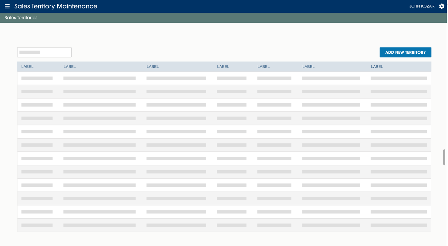
Sales Territories
To start off the Hi-Fi wireframes, I tackled the most complicated task first: the Sales Territory Editing. This page would be data intensive and receive the most user traffic, so we needed to make sure the experience was smooth. We went through a myriad redesigns of the territory form because of this before we even felt that the form was getting close to what felt right to the flow.
We got the go ahead on the table and search page design for the territories and filled it with the correct data columns, albeit dummy data. Afterwards we moved to the form. While it is most common for UX to have a single text field per line, we felt comfortable abandoning that rule. This is due to the users not being new users, but power users. So they would eventually learn these forms inside and out after initial use, plus the sheer amount of data needed in this form was much more than a common sign up or consumer form.
.png)
.png)
.png)
.png)
Different layouts for the add new sales territory form
We eventually got moving with a form design and completed the first task. However, we would later completely reconstruct this form, as the developers found new data while working on the back end and dependencies that weren't known before.
Upload File
For this task the users want the ability to upload an excel file and change multiple records at a time. However, we found that they wanted to be able to upload two different types of files one for the Sales Territories and one for Postal Codes. Due to the different form fields, they needed a different file structure to upload. So, we kept them to only upload one file at a time and we found an older app which had a similar file upload function. So, I remade that UI within Figma, and presented it to the stakeholders.

Upload File page design take from another app
From this presentation, the stakeholders liked it, but us on the UX team were a bit dissatisfied. Mainly due to lack of error handling for the user. It shows how many errors there are within the file, but not where they are in the file, or what the errors are. From a little digging, we found another more recent app which had exactly what we were looking for. This presented us with a progress bar for validation and error display.
.png)
Upload File redesign take from a more recent app that UX and the stakeholders liked better
Finally, we realized the amount of errors could potentially be in the hundreds. So to remedy this we got rid of the errors appearing on the main screen, and had it link to a modal that would show all errors and which would be scrollable.
.png)
.png)
Small redesign to account for error handling
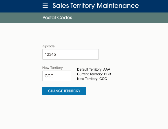
Postal Codes
After getting the stakeholder approval on the upload files, we started on the next task, which was Postal Codes. This design was put through relatively quick thanks to me getting the hang of working within the style guide and communication with the stakeholders. Though we did try a few more alternative designs, we found that keeping things simple would be easiest for both users and the devs.
.png)
.png)
Alternate design - Hard Codes
.png)
Final design - Hard Codes
Hardcodes
Finally, we got to the last task, Customer Hardcodes. Which again was very quick to get approval, due to how similar it was to the last task and most of the requirements for this page already being known. This task only took one design. I did create an alternate design, however this was more as a personal goal to try and think outside the box.
.png)
.png)
Validation
Data Rediscovery
As I mentioned before there was a major issue about halfway through the project due to some new discoveries within the databases. As we handed off the first design to the devs, they found that the databases had a different structure to what the Greenscreens had. Due to this the requirements of the form had changed. We initially thought that the territory code will be the only thing needed for the form to submit, but there turned out to be lots more dependencies and records.
We went through multiple brainstorming sessions until we settled on a form that made sense not only to the structure of the database, which made it easier on the devs. But also made sense to the users, which kept the experience smooth and uncomplicated. It would allow fields to enable once the previous input field was needed, sort of a cascade effect.

take aways
Working within strict style guide
This was my first experience working within a very robust style guide. I really liked being able to focus on the thought process and the UX of the app, rather than focusing on creating all the components themselves and worrying about small design fixes. Throughout my tenure of Uline I would also help with the maintain component library and the style guide which was incredibly fun.
Don’t move to quick when designing
Within my first low fidelity designs, I went about creating all the pages at once. This put a lot of strain on me, as I had to work very quickly and not think through each design or alternative routes. Overall this hurt the UX of the app, since I wasn't able to flesh out each section. I really want to thank my mentor for reigning me in, as I think the app and experience really benefited from it.
Stakeholder communication
Throughout this app I was constantly in talks with the actual users of the app. This allowed me to get real feedback on the designs, which is valuable experience for user communication and testing. It also allowed me to get used to presenting to groups and taking critiques of the pages.
Working with software dev issues
A big issue with this app was how the data discovery impacted the design throughout the process. We would learn new data and redesign according to it, which resulted in the form redesign about halfway through. This is something that was incredibly helpful to both the devs and I to figure out the problem solving issues together. We were in constant communication, so that if my designs were out of date or too much tech debt I would be able to help those issues as quickly as I could.


